A key aspect of our methods for studying medieval vaults is the careful study of accurate measurements. Once the measurements have been extracted from our 3D models, we can begin to analyse them with the help of statistics. Statistics are used for two distinct purposes in our research. The first is to assess the accuracy of our measurements, specifically how reproducible our results are and what kind of variation would be expected from one observer to the next. The second is to identify patterns within the data which are useful for interpreting the vault’s design process, whether by defining groups of ribs with common measurements or finding outliers and irregularities. By using a variety of statistical tools, we are able to proceed with confidence in both the accuracy of our measurements and the plausibility of our design hypotheses.
Testing for accuracy
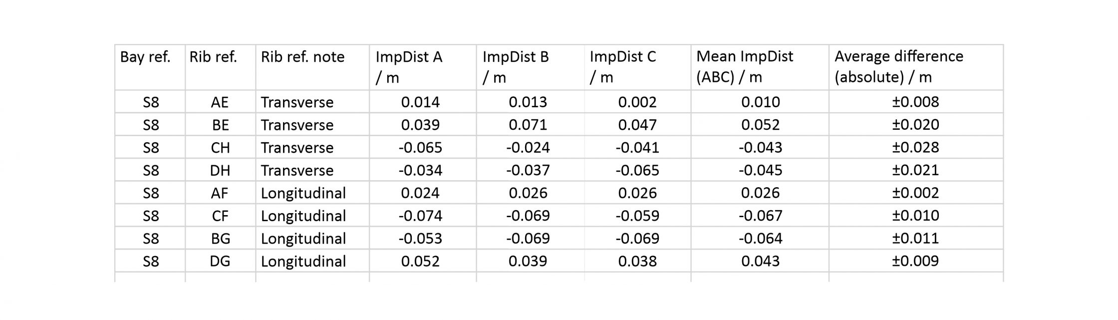
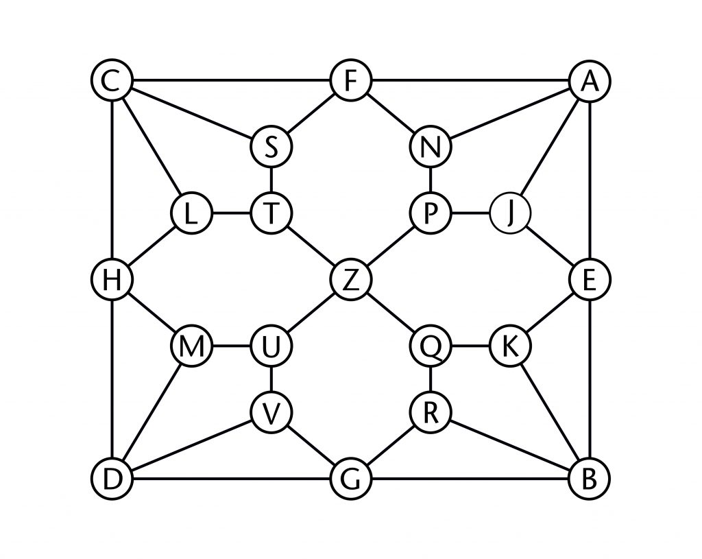
As our project involves a team of several different researchers, it was necessary to work out how variable our results could be between different tracings of the ribs. This was investigated using two different tests, both focusing on the choir aisles at Wells Cathedral. The first was an interobserver error test, in which three different researchers (A, B and C) were asked to trace the same two bays (S8 and N5) independently. The second was an intraobserver error test, where the same researcher traced the same bays on two separate occasions (A and D).
The results of these tests were tabulated as normal and the differences between them compared using a Bland and Altman error test. This involved plotting the differences between results for a single rib against their mean value, producing a set of simple graphs which allowed us to assess their distribution. In addition, we calculated the mean and standard deviation of the differences and added them to the graph using horizontal lines, adopting the standard practice of using two standard deviations to indicate a margin of error.
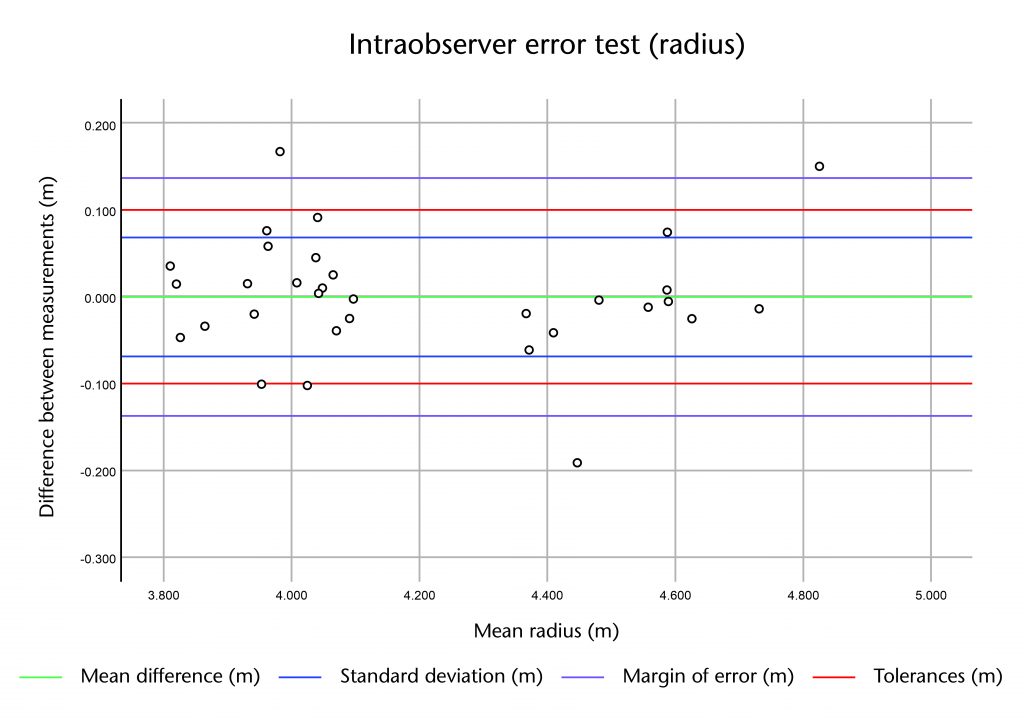
In general the distribution of the differences was quite tight, with most of the results falling within two standard deviations of the mean. This suggests that the measurements did not vary greatly from one repetition to the next. However, there was a noticeable difference between the three types of measurement. The least variable measurement was the apex height, with a standard deviation of 7mm for the interobserver and 27mm for the intraobserver error test. The greatest variation was found in the radius, with a standard deviation of 83mm and 69mm for inter- and intraobserver error respectively, whilst the impost distance sat in the middle with standard deviations of 43mm and 44mm. With the exception of the radius, a greater variation was found in the measurements from the intraobserver test. This may be because the test conducted over a longer time period, opening up a greater potential for minor changes in method to occur between the two tracing sessions.
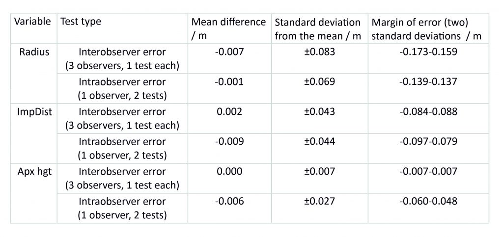
The results of these tests provided us with a clear impression of what the expected variation would be within a given sample of measurements. This allowed us to assess how confident we could be in the accuracy of our results, as well as to establish a set of tolerances which we could use in our work. Whilst the raw data gathered using our laser scanning is accurate to within a millimetre, the tests showed that our tracing processes were not. Consequently, though we continued to record measurements in millimetres (e.g. 4.522m), we decided that we would only publish our results to the nearest centimetre (e.g. 4.52m).
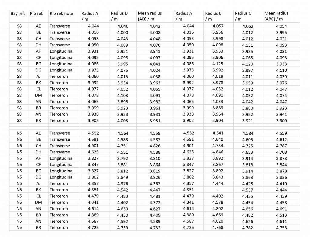
With this in mind, we eventually settled on tolerances of ±0.10m for the radius, ±0.08m for impost distance and ±0.05m for apex height when identifying similar measurements. Our working assumption was that any two results that sat within these tolerances might plausibly be intended to be the same value. Anything that was outside these tolerances would therefore require more detailed study to explain why the two results were so different, whether it was because of inaccuracies in the tracing or measuring process or a genuine difference in design between the two ribs. For example, in bay S8 the radius of almost all the ribs are within 0.10m of their mean (4.01m), strongly suggesting that they were intended to be the same value. However, the radius of the tierceron AN is slightly outside this margin (3.90m), meaning that it needed to be checked for irregularities. In this particular case, a closer inspection revealed the difference between the ribs to be negligible, meaning that it was also probably intended to be the same.
Looking for patterns
The second use of statistics in our research is to help identify patterns in our data. This is initially a process of trial and error. Groups of ribs are identified through a combination of visual examination of the mesh models and careful study of the data tables. An average (arithmetic mean) is then taken for the radius, impost distance and apex height within each group and compared. Those which are within our tolerances would might provisionally be accepted as a group with a shared geometry, whereas those which show more variation would need to be investigated in further detail. Depending on the results, these groupings of ribs might be split, fused or rejected entirely, the process continuing until a coherent pattern starts to emerge. However, it is not always possible to identify patterns using the mean values alone, nor is it always clear how meaningful they might be from a design perspective. In these cases we make use of two additional tools for assessing our results: conditional formatting and K-Means cluster analysis.
Conditional formatting
Conditional formatting is a tool within Microsoft Excel which provides a visual means of grouping results based on rules regarding their relative value. The ‘Color Scales’ function allows the user to assign each value a colour based on its position within the range of a particular measurement (radius, impost distance etc.). Colours are assigned using a three-colour gradient, red representing the maximum, yellow the median or middle and blue the minimum value. This allows all of the data within a certain class to be grouped visually, their similarity being judged in accordance with their gradations in colour.
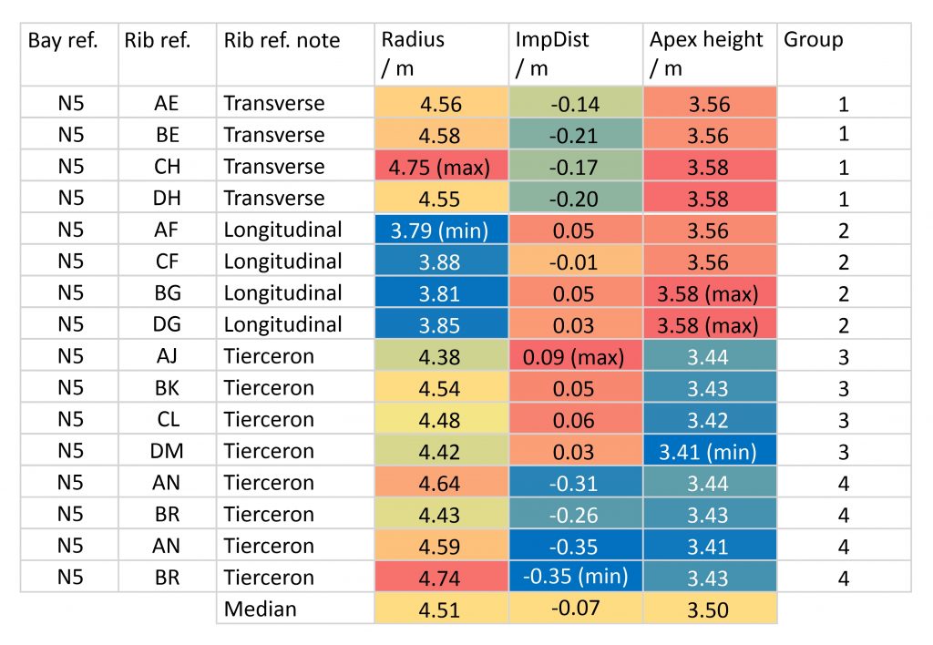
Using Color Scales as a visual aid, we are able to compare distribution patterns across multiple variables simultaneously. This makes it easier to identify groups which share a similar radius, impost distance and/or apex height. In addition, it makes it easier to visualise similarities across multiple groups, enabling us to find instances of the same measurement being reused multiple times within the vault’s design. This allowed us to assign each rib into a provisional group for the purpose of deriving averages values, as well as providing valuable information for interpreting the underlying design process of the ribs.
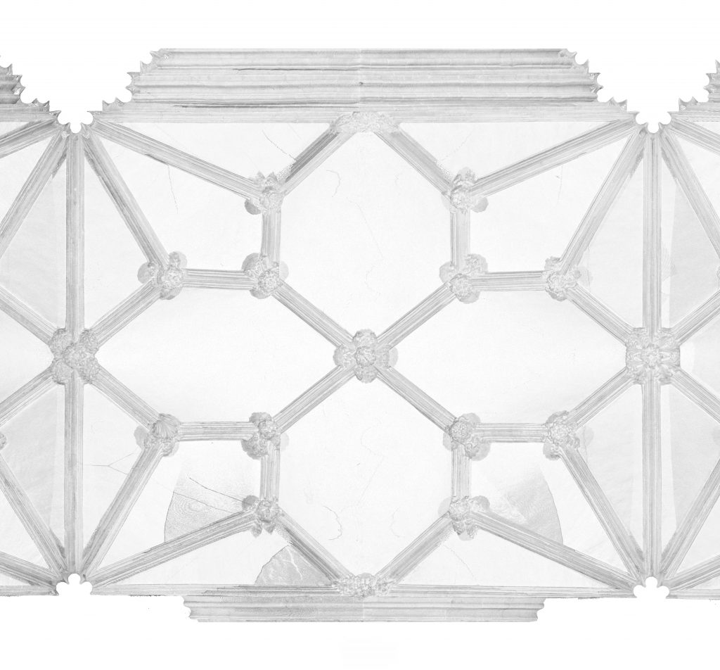
For example, in bay N5 of the north choir aisle at Wells Cathedral the apex heights fall into two distinct groups. Whereas the transverse and longitudinal ribs are clustered tightly around the red (maximum) end of the colour spectrum (average 3.57m), whereas the tiercerons are all situated around the blue (minimum) end (average 3.43m). This illustrates that the data is polarised between two distinct apex heights, an observation which is confirmed by study of the 3D model. For the impost distance, however, there appear to be three different groupings of values, with the longitudinal ribs and transverse tiercerons clustered around the maximum (red), the longitudinal tiercerons around the minimum (blue) and the longitudinal bounding ribs slightly closer to the median (green). By far the most variable set of results are the radii, which appear to include a number of clear anomalies and outliers. Whereas the transverse and longitudinal bounding ribs each appear to have their own distinct radius, the tiercerons are far more variable. Nevertheless, the results suggest that each type of rib may have been designed with its own unique combination of the three variables, implying that the data can be divided into four distinct groups.
K-Means clustering
Even with the assistance of conditional formatting, it is not always clear whether the patterns which we identify are meaningful. For these cases we decided to test our groups further using SPSS Statistics, an advanced statistical analysis program made by IBM. The specific method which we use is K-Means clustering, a process which involves selecting a fixed number of groups or ‘clusters’ into which the data could be divided based on a set of specified variables. An iterative algorithm is used to sort the values into these clusters, repeating the process until the results are consistent from one iteration to the next.
The principal advantage of K-Means clustering is that it is a multivariable method of statistical analysis. Whereas the Color Scales function sorts each of our variables separately, K-Means clustering sorts them together, grouping the results based on similarity across all three variables. This allows us to make finer distinctions within our data sample, providing a rigorous means for testing the accuracy of our groupings as well as generating alternative clusters which can reinforce or challenge our hypotheses.
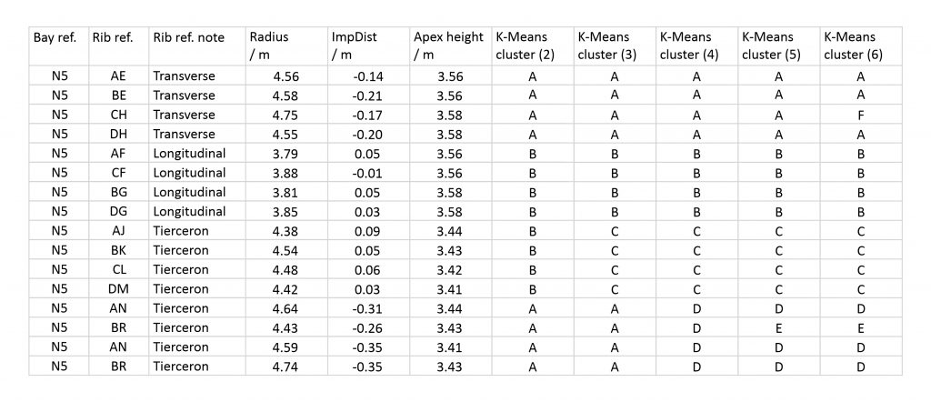
For example, if we suspect that the ribs within a particular run of vaulting were divided into four groups, we can use SPSS to sort the data into four clusters and see whether the distribution of results are as we would expect. The hypothesis can then be further tested by changing the number of clusters and noting the changes, allowing us to pinpoint anomalous or erroneous results and identify alternative groupings within the sample. If the groupings remain consistent with a lower number of clusters, then the case for dividing the ribs accordingly is reinforced. Similarly, if a higher number of clusters reveals only singular or haphazard anomalies rather than a consistent pattern, it is likely that the initial grouping was correct.
In the case of bay N5 at Wells, a K-Means clustering based on four groups reveals a neat division between rib types, with each set of four ribs fitting within a distinct cluster. Smaller numbers of clusters are entirely consistent with this result, with each set of four ribs remaining together from one analysis to the next. This pattern continues when higher numbers of clusters are tried, with singular anomalies appearing within the sample. When compared to the results of the conditional formatting, it is clear that each of these values is slightly anomalous. This means that the small differences between individual ribs can be taken into account when producing a design hypothesis for the whole vault, explaining some of the irregularities which can be found during our testing process.
Further reading
- Bland, J. and Altman, D. (1986) ‘Statistical Methods for Assessing Agreement between two methods of clinical measurement’, The Lancet, 8476 (1986), pp. 307-10.
- Buchanan, A., Hillson, J. and Webb, N. (2021). Digital Analysis of Vaults in English Medieval Architecture. New York and London: Routledge.
- Webb, N. & Buchanan, A. (2017). ‘Tracing the Past: Establishing Tolerances when Investigating Medieval Vault Rib Geometries using Digital Tools’, In Envisioning Architecture: Space/Time/Meaning Vol. 1 (pp. 30-37). Glasgow School of Art, 8 September 2017. [This article contains an earlier iteration of our methodology, with slightly different tolerances.]

2 Comments
[…] Find out more about our statistical methods for analysing data […]
[…] out more about vault design in the choir aisles at Wells Find out more about the role of statistics in analysing the choir aisle vaults at Wells View all of our 3D models of vaults at […]